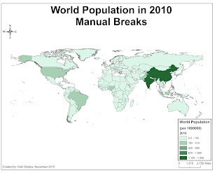
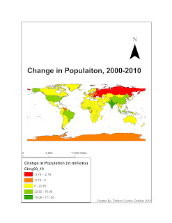
2 effective and ineffective GIS maps:
Effective Maps:
1. Choropleth map- One of the most frequently used maps in geography. It is uses a coloring scheme which are different colors or a graduate color scale inside defined areas on a map in order to show value levels and indicate the average values of some property or quantity in those areas. These maps can effectively be used to report area values at virtually any scale, from global to local and that data can be thought about in a variety of ways at many different levels of analysis, from general overall patterns to detection of details. However, since the choropleth map uses an average number to represent defined areas, the viewer cannot gain detailed information or a perspective on any area's internal conditions.
2. Isopleth map- Show an imaginary surface by means of lines joining points of equal value, "isolines" e.g. contours on a topographic map. These maps are used for phenomena which vary smoothly across the map, such as temperature, pressure, rainfall or population density. This map design is effective because it requires a large amount of data for accurate drawing.
Ineffective Maps:
1. Dot distribution map- Also known as 'dot density' map is a map type that uses a dot symbol to show the presence of a feature or phenomenon. These maps rely on visual scatter to show spatial pattern. The map design is ineffective due to construction of dots maps involves tedious calculation especially when determining number of dots. Also, locating dots on map is to the certain extent a personal and subjective decision. Therefore, two dot maps that are being done by two individuals using the same data may rarely be identical.
2. Geologic map- Also known as a geological map is a special-purpose map made to show geological features such as rock units or geologic strata which are shown by color or symbols to indicate where they are exposed to the surface. this map design might be ineffective since might end having too much information therefore portraying a clustered outlook for viewers.
Intro to GIS:DSC
Friday, January 15, 2016
Thursday, November 26, 2015
Week 11 Assignment
It is not the best assignment since I had problems getting the spreadsheet to connect and by the time I was able to figure it out my I had thirty minutes until some of the features were over. So I deeply apologize if i ended the course on a poor note.
Tishawn
Tishawn
Wednesday, November 25, 2015
Wednesday, November 18, 2015
Saturday, November 14, 2015
Sunday, November 1, 2015
7 Assignments
Buffer: Creates buffer polygons around input features to a
specified distance.
Clip: Extracts input features that overlay the clip
features. Used to cut out a piece of one feature class using one or more of the
features in another feature class as a cookie cutter, and also for creating a
new feature class.
Intersect: Creates a geometric intersection of the input
features. Features or portions of features which overlap in all layers and/or
feature classes will be written to the output feature class.
Union: Creates a geometric union of the input features. All
features and their attributes will be written to the output feature class.
Merge: Combines multiple input datasets of the same data
type into a single, new output dataset. This tool can combine point, line, or
polygon feature classes or tables.
Dissolve: Aggregates features based on specified attributes.
Friday, October 30, 2015
Graduated Symbol Map
Buffer- Creates buffer polygons around input features to a specified distance
Clip- This is basically used to select and cut out a part of the data you want to use from a bigger area
Intersect- Allows for only the features or it parts which overlaps or intersects in layers to create a new file
Union- Shows all features and their attributes in the output feature class unlike with intersect where only the common part is shown.
Merge- Combines multiple inputs of the same data type to create one output
Dissolve- Groups features based on specific attributes
Subscribe to:
Comments (Atom)


